Because waaaaaay too much work, care, and collaboration across a company goes into re-crafting the product experience to deliver on a brand promise. Some notable examples are below. Projects I’ve driven across silos, with executives, stakeholders, and users. Setting strategy, leading the process, directing visual and verbal voice, guiding and mentoring, shaping based on needs of our users, and often times jumping in just to help get it done. WEBSITE REIMAGINING How do we tell the story of Zipcar and where it fits into this increasingly competitive and demanding world of urban mobility? Start with the Value Prop, unified set of personas, and how the brand is experienced through every touchpoint. Then get to the real work...Move potential members down the pipeline toward signing up more quickly and efficiently, while also educating those who weren’t familiar with Zipcar. Oh, and make the site design not make me throw up in my mouth just a little bit (it was really bad before). ROLE: Objective setting with senior company leadership, marketing and content strategy, product ownership, UX process, global stakeholder wrangling (not surprisingly there was a RACI about the size of a dictionary), creative direction, IA, copywriting, and some design work. BEHIND THE SCENES: With a website that was dated and full of friction points along the way to education and sign-up, everything needed to be re-imagined. We had to tell the complete story while making it easy. After several start-stop cycles (including an engagement with HUGE), lots of meetings with global stakeholders, and objectives setting, we decided to bring it all inside. Based on insights gleaned from our new user research program, I used a combination of UX/I designers (for core flow and functionality components), brand designers (visual design language and education panels), and copywriters to stitch together a cohesive story answering: What is it? How does it work? How much is it? How do I sign up? Overall, we did this using a combination of progressive disclosure, content “chunk” stacking, and short narrative storytelling in our voice, along with social proof. We broke it down into sections, releasing at a 50/50 split for A/B testing until we eventually got to a 50% improvement in conversion rate, and lowered abandonment by 18%.  THE PROCESS: Often times we were working on specific business problems and the process is shorter than others (hellooooo agile!). This is great because that means we had direct research and business insights giving us the playbook, and our job is to solve the problem. Other times, we need to search for the true nature of what we need to do, and the process looks like this: 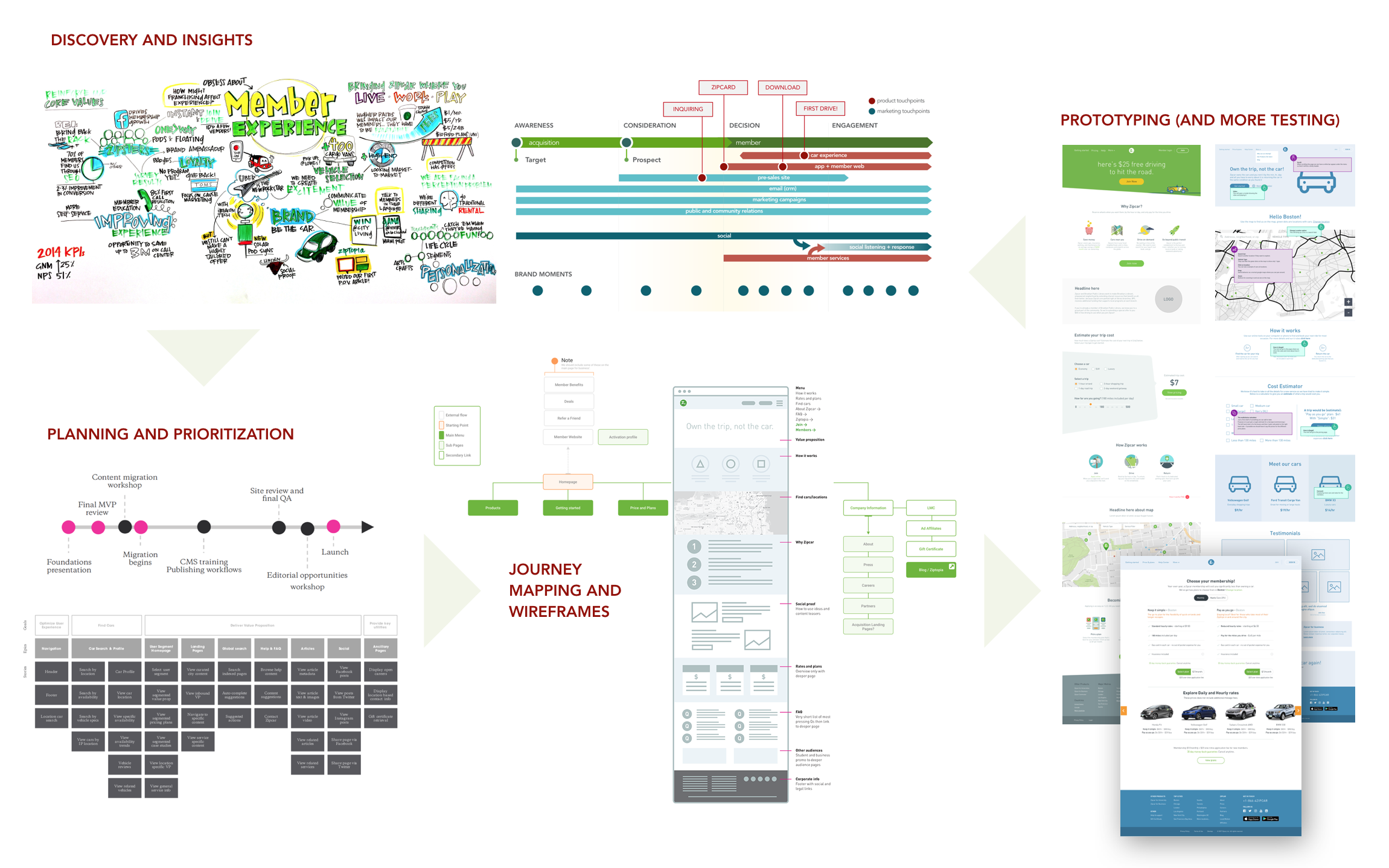 APP REBOOT The Zipcar app was in pretty good shape–until it came to members using the cars. The app needed a good facelift and education on nuance of the service, but the reviews were being dragged down by self-inflicted wounds in other areas. We had to address that with entirely different projects. ROLE: Brand refresh integration, product/service marketing, downstream UX process, collaborating tightly with mobile product management, global stakeholder wrangling, creative direction, copywriting. BEHIND THE SCENES: The original need (identified by me coming in the door) was that our brand was stagnant and looking dated. Mostly visual system, but still important was how our verbal voice was coming through. We needed it to be more witty and sassy while not compromising clarity and causing unnecessary delay in letter the member get into to their car. Along the way we introducing new a new service and incorporating functionality enhancements at the same time. Prioritization on the engineering side (not on my team) was challenging so on-going evangelism for the business, the brand, and the member needs was a job in itself. I had a collection of UX/I designers and copywriters collaborating for a complete marriage of form, function, and usability. We continued on a 2-week release cycle to ensure on-going improvement based on member insights. Once released, after 120+ research sessions and slightly fewer iterations/prototypes, the iOS app went from 1.3 to 4.4 stars (as of the start of 2018). 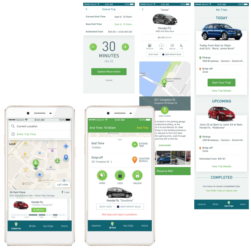 CITY-LIVING SURVEY ANIMATED INFOGRAPHIC Standard infographics have pretty much a 50% chance of catching attention to most audiences. Knowing this, and armed with a deep knowledge of our thought leadership audience, we had a chance to really make an impact. ROLE: Marketing objectives, campaign planning, IA, creative direction, and collaboration across RACI to ensure we put the work to best use. BEHIND THE SCENES: Having the “story” and audience already settled, we dug into visual design explorations (alot of them) to make sure this mini campaign stands out in the crowded market landscape. It was really a campaign that we could utilize in nearly countless ways for content and engagement with community leaders and influencers. Eventually won GDUSA award while doubling our exposure rate to the key audience. 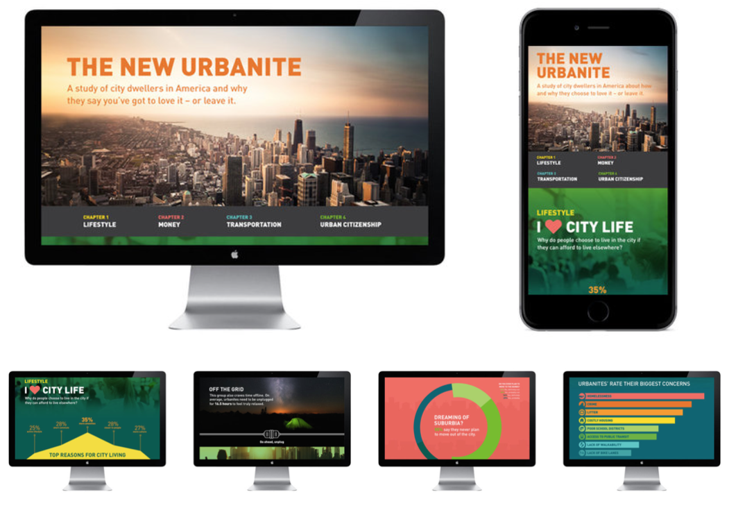
|